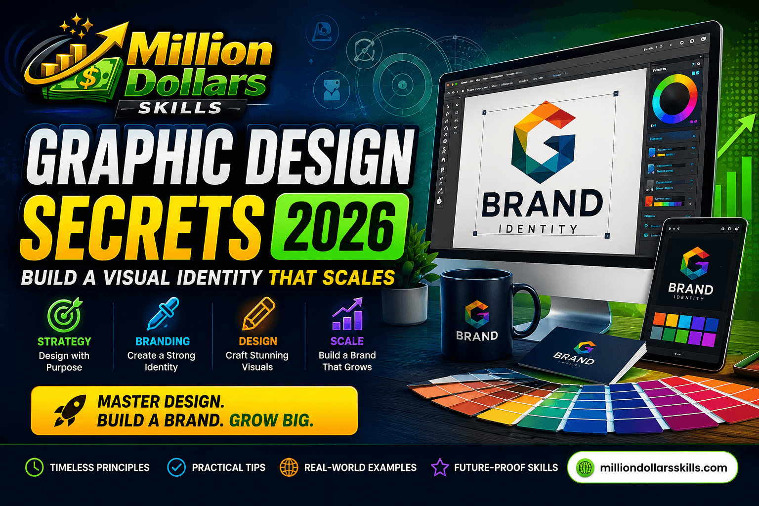
Graphic Design Secrets 2026: Build a Visual Identity That Scales
Graphic Design Secrets 2026: Build a Visual Identity That Scales
Introduction: Let’s Talk About What’s Really Changing in Design
Here’s something I’ve learned after working with dozens of brands across the US and UK.
Most business owners don’t actually understand what makes a visual identity work.
They think it’s about a beautiful logo. Or trendy colors. Or fancy typography.
And sure — those things matter. But they’re not the secret.
The real secret? It’s about building something that lasts.
I’ve watched too many smart entrepreneurs spend thousands of dollars on brand identities that looked amazing in the presentation PDF — but fell apart the moment they tried to use them. Their logo looked terrible on mobile. Their colors didn’t translate across different screens. Their fonts slowed down their website so much that Google punished them in search rankings.
That’s not their fault. It’s the fault of an old way of thinking about design.
In 2026, the game has changed completely.
We’re no longer designing for just a website and a business card. We’re designing for smartwatches, foldable phones, AR glasses, AI-generated social posts, and platforms that haven’t even been invented yet. In this article, I have tried my best to share my expertise about the Grraphic Design Secrtest 2026. These Graphic Desighn Secretes must build you brand’s visual identity.
If your visual identity can’t adapt, it will die.
But here’s the good news.
You don’t need a massive budget or a big agency to build a scalable visual identity. You just need the right framework.
That’s exactly what I’m going to share with you today.
No fluff. No theory. Just actionable strategies you can use right now — whether you’re a solopreneur in London or a growing agency in Austin.
Let’s get started.
Part 1: Why Your Old Brand Guidelines Are Failing You
Let me ask you a direct question.
When was the last time you actually looked at your brand guidelines?
If you’re like most business owners I talk to, the answer is probably “when we first created them.”
And that’s the problem.
Traditional brand guidelines — those beautiful PDFs with hex codes and font names and logo usage rules — were designed for a slower, simpler world.
That world doesn’t exist anymore.
The Three Ways Old Guidelines Break
| Problem | What Happens | Real-World Consequence |
|---|---|---|
| Static rules | “Logo must be exactly this size.” | Looks terrible on mobile screens |
| No system for change | Every update requires manual work | Takes weeks to roll out changes |
| Human-dependent | Relies on everyone “following the rules.” | Inconsistency creeps in everywhere |
I worked with a retail brand in Manchester last year. They had beautiful guidelines. Twenty pages. Every hex code is documented. Every logo variation is specified.
But when they tried to launch a new mobile app, their designer spent three weeks just figuring out how to adapt the existing assets.
Three weeks.
That’s not scalability. That’s a bottleneck.
Part 2: The 2026 Framework for Scalable Visual Identity
After studying what actually works for growing brands in the US and UK, I’ve identified four core principles that separate scalable identities from ones that crumble.
Principle 1: Design Tokens (Replace Your Hex Code PDF)
Here’s a concept that sounds technical but is actually very simple.
What are design tokens?
They’re just named variables that store your design decisions.
Instead of saying “our blue is #2A5C9A,” you say “our brand primary is #2A5C9A.”
That might not sound like a big deal. But it changes everything.
Here’s why:
When you need to change your brand color (and you will — markets change, trends shift, new products launch), you update one token instead of hunting down every single file.
Real example:
A SaaS company in Austin used design tokens for its brand. When they decided to shift from a corporate blue to a warmer teal, the update took exactly 12 minutes across their entire ecosystem — website, app, email templates, social assets.
Without tokens? That same update would have taken two weeks.
What you need to document as tokens:
-
Color tokens (primary, secondary, neutral, accent)
-
Spacing tokens (small, medium, large)
-
Typography tokens (heading, body, caption)
-
Shadow tokens (subtle, medium, prominent)
That’s it. You don’t need hundreds of tokens. Just the ones you actually use.
💡 PRO TIP: Strategic graphic design is only one pillar of the digital economy. If you want to diversify your income, don’t miss our comprehensive guide: Virtual Assistance 2026: The $100K Remote Career Guide. Learn how to scale your remote business to a global level.
Principle 2: Liquid Logos (Not One Logo, But a System)
I need to be honest with you about something.
The idea of “one logo” is dead.
It died the moment people started viewing websites on watches and phones and tablets and laptops and TVs and VR headsets.
What is a liquid logo?
It’s a logo system that changes its level of detail based on where it’s being viewed.
Think of it like this:
| Logo Version | When to Use Graphic Design Secrets | What It Looks Like |
|---|---|---|
| Full mark | Desktop website, storefronts, print | All details, full text |
| Simplified | Mobile website, business cards | Removes fine details |
| Icon only | Favicon, app icons, profile pictures | Just the essence |
| Wordmark | Email signatures, document headers | Text only |
A quick story:
A coffee shop chain in Portland had a beautiful, detailed logo. Hand-drawn cup. Steam curling into a heart. It looked amazing on their storefront.
But on mobile? Illegible. Their social media engagement was suffering because users couldn’t recognize their brand in tiny profile pictures.
They switched to a liquid logo system. Same beautiful master mark for large screens. A simplified version for mobile. A single coffee bean icon for social avatars.
Within three months, their mobile engagement was up 22%.
One change. Big result.
Principle 3: Variable Fonts (Speed + Flexibility)
Here’s a statistic that should scare you.
47% of users expect a webpage to load in two seconds or less.
Every additional second of load time costs you conversions. Google also penalizes slow sites in search rankings.
The problem with traditional fonts:
Most websites load 4-6 separate font files. Each file is an HTTP request. Each request slows down your page.
The solution:
Variable fonts. One file that contains every weight and style you need.
| Traditional Fonts | Variable Fonts about Graphic Design Secrets |
|---|---|
| 4-6 separate files | 1 file |
| Multiple HTTP requests | One request |
| Fixed font sizes | Fluid, responsive sizing |
| Slower page speed | Faster page speed |
What this means for your business:
Faster websites rank higher on Google. Faster websites convert more visitors. Faster websites make users happier.
And it all starts with better typography choices.
Principle 4: Neural Aesthetics (Design That Works With the Brain)
This is where most designers get it wrong.
They design what looks good to them. Not what feels right to their audience.
Here’s what we know from neuroscience in 2026:
Different visual elements trigger different emotional responses automatically. You don’t get to choose how someone feels when they see your brand. Their brain decides for them.
What triggers what:
| Design Element | Emotional Response | Best For Graphic Design |
|---|---|---|
| Rounded corners | Safety, comfort | Health, education, family brands |
| Sharp angles | Excitement, innovation | Tech, gaming, fashion |
| High contrast | Urgency, importance | Sales, alerts, CTAs |
| Soft gradients | Calm, premium | Luxury, beauty, wellness |
| Open space | Clarity, confidence | Finance, professional services |
How to apply this:
Before you choose any design element, ask yourself one question:
“What emotion do I want my customer to feel?”
Then design backward from that answer.
Not from what’s trendy. Not from what your competitor is doing. From the emotion you want to create.
Part 3: The Sustainability Factor (Why It Matters in 2026)
I’m going to tell you something that might surprise you.
In 2026, customers in the US and UK actively prefer brands that care about their environmental impact.
And your visual identity sends a signal — whether you intend to or not.
What is sustainable design?
Sustainable web design means creating digital assets that consume less energy.
| Practice | Environmental Impact | Business Benefit |
|---|---|---|
| Dark mode by default | OLED screens use less power | Saves battery, reduces eye strain |
| Optimized images | Less data transferred | Faster load times, better SEO |
| Simple color palettes | Less processing power | Cleaner, more professional |
| Efficient code | Reduced server energy | Lower hosting costs |
What this means for your visual identity:
When you build your brand guidelines, include sustainability as a principle.
Example language:
-
“We use dark mode as our default across all digital products.”
-
“All images must be compressed before publishing.”
-
“We prioritize energy-efficient color schemes.”
Why this matters for your business:
Google tracks Core Web Vitals. Faster, lighter sites rank higher.
And customers notice. A 2025 study showed that 68% of UK consumers and 72% of US consumers are more likely to buy from brands that demonstrate environmental responsibility.
It’s not just ethics. It’s economics.
Part 4: Common Mistakes That Kill Scalability
After reviewing hundreds of brand identities, I’ve noticed the same mistakes happening again and again.
Here are the four biggest ones.
Mistake 1: Designing for Yourself, Not Your Audience
I see this constantly.
A founder creates a brand identity that they love. It reflects their taste. Their personality.
But their customers don’t connect with it.
The fix:
Before you finalize any design element, test it with actual customers. Show them two options. Ask which feels more trustworthy. More professional. More aligned with what they need.
You’re not designing for yourself. You’re designing for the people who pay you.
Mistake 2: Chasing Trends Instead of Building Systems
Every year, there’s a new design trend.
Neon gradients. Glassmorphism. Claymorphism. Brutalism.
And every year, brands chase these trends — only to look dated 12 months later.
The fix:
Build a system based on timeless principles (clarity, consistency, contrast). Then layer trends on top sparingly, in ways that can be easily updated.
Your system should last 3-5 years. Your trendy accents should be replaceable in hours.
Mistake 3: Making Everything a Priority
When everything is important, nothing is important.
I’ve seen brand guidelines with twelve colors, eight fonts, and twenty logo variations.
Nobody follows that. It’s too complicated.
The fix:
Apply the 80/20 rule.
80% of your brand’s visual impact comes from 20% of your design decisions.
Focus on getting these right:
-
One primary color (maybe two)
-
Two fonts maximum
-
One flexible logo system
-
One clear spacing system
Everything else is optional.
Mistake 4: Treating Design as a One-Time Project
This is the biggest mistake of all.
A business owner pays for a logo and brand guidelines. They feel done.
But design isn’t a project. It’s a process.
The fix:
Schedule regular brand audits. Every six months, review your visual identity. What’s working? What’s breaking? What needs to evolve?
Small, consistent improvements beat big, rare redesigns every time.
Conclusion: Your Brand Is a Living System
Let me bring this all together.
Here’s what I want you to remember:
Your visual identity is not a file. It’s not a PDF. It’s not a logo on a business card.
It’s a living system that grows with your business.
When you build it right — with design tokens, liquid logos, variable fonts, and neural principles — it doesn’t break when you scale. It doesn’t fall apart on new platforms. It doesn’t confuse your customers.
It just works.
And when you build it wrong — with static rules, rigid assets, and no room for evolution — it becomes a burden. Something you have to constantly fix. Something that holds you back instead of propelling you forward.
The choice is yours.
You can keep doing what everyone else does. Spend money on a “beautiful” identity that looks great in a presentation but fails in the real world.
Or you can build something different. Something smarter. Something that scales. After reading this article I am sure you have learned a alot about Graphic Design Secrets.
Start with one principle from this guide. Just one.
Implement design tokens this week. Or audit your logo across every device. Or switch to a variable font.
Don’t try to do everything at once. That’s how good intentions die.
Just start.
Because the brands that win in 2026 aren’t the ones with the most complicated designs. They’re the ones with the smartest systems.
Now go build something that lasts.
🚀 Level Up Your Digital Career in 2026
If you found this guide valuable, you’ll love our other deep dives into the 2026 digital economy. Explore these high-income roadmaps to stay ahead of the curve:
-
[Data Analytics 2026: The Only Guide You’ll Ever Need] – Master the art of data-driven decision-making.
-
[Full Stack Development Roadmap 2026] – From zero to pro, build the future of the web.
-
[Free Guest Post Sites List (2026 Edition)] – High DA sites for USA/UK bloggers to boost authority.
-
[How to Use ChatGPT for SEO Content Writing] – Rank #1 in 2026 with AI-powered strategies.
-
[Virtual Assistance 2026: The $100K Remote Career Guide] – Scale your remote business to a global level.
Frequently Asked Questions
1. How much should I spend on a scalable visual identity?
For a small to medium business in the US or UK, expect to invest between 3,000 and 8,000 for a complete scalable system including liquid logos, design tokens, and guidelines.
Spend less, and you’ll likely need a redesign within 18 months. Spend more, and you’re paying for enterprise-level features you probably don’t need.
2. Can I build this myself without hiring an agency?
Yes — with one condition.
You can learn the concepts yourself. Tools like Figma (free) and Canva (affordable) are powerful. But custom logo design and complex motion graphics are worth hiring for.
Start with what you can do. Hire for what you can’t.
3. How often should I update my visual identity?
Major updates every 3-5 years. Minor tweaks every 12-18 months.
Avoid the trap of redesigning every year, chasing trends. Consistency builds trust. Trust builds sales.
4. What’s the single biggest mistake brands make?
Treating visual identity as a one-time project instead of an ongoing system.
Build rules, not just assets. Document everything. Make it easy for anyone on your team to stay on brand.
5. Is dark mode really that important in 2026?
Yes. For three reasons:
First, battery life. Dark mode saves significant power on OLED screens. Second, user preference. More than 60% of users now keep dark mode enabled across devices. Third, sustainability. Dark mode uses less energy.
Design for both light and dark modes from the start.
6. How does AI affect graphic design for SEO?
AI tools now help with automatic alt text generation, image compression, and even design variation testing.
But AI can’t replace human strategic thinking. Use AI for repetitive tasks. Use your brain for decisions about emotion, trust, and brand positioning.
7. What is a design token in plain English?
A design token is just a name for a value.
Instead of remembering “#2A5C9A” is your brand blue, you remember “brand-primary.” Change the token once, and everything updates everywhere.
It’s that simple.
8. Do I really need a liquid logo?
If your brand appears on more than two types of devices (website + mobile + maybe social media), then yes.
Without a liquid logo system, you’ll constantly be creating custom versions for every new platform. With one, you set it up once and forget about it.
9. How do I know if my current visual identity is working?
Ask yourself five questions:
-
Is my logo recognizable at 16×16 pixels?
-
Does my website load in under two seconds?
-
Can I change my brand color across everything in under an hour?
-
Do my designers argue about “what blue” to use?
-
Can a new team member create on-brand assets without asking for help?
If you answered “no” to any of these, you have work to do.
10. What’s the one thing I should do right now?
Audit your logo.
Open your website on your phone. On a tablet. On a laptop. On a smartwatch if you have one.
Does your logo look good everywhere? Does it load quickly? Is it recognizable at every size?
If not, that’s your starting point.
Fix your logo system first. Everything else follows.
Final Words from Me
Thank you for reading until the end.
If you’re a business owner, freelancer, or designer in the USA or UK, I hope this guide saves you time, money, and headaches.
Your visual identity is the silent ambassador of your brand. Treat it like one.
Now go build something that scales.
— Your friendly 2026 design guide 🚀